Friday 23 December 2011

Pretty Packaging: Herbal Essences

A free sample in Marie Clare, January issue - £2
Such pretty packaging I oculdn't 
resist scanning it into the computer.
This packaging has a great use of colour, 
such a tropical looking blue that has great impact, 
then on top the grunge like marks in silver and green. 
I just looked up what grunge actually means, 
one of its definitions is dirt and grime, 
the other being a type of rock music. 
But now I finally know.
The beautiful flowers adorning the packaging are orchids
and look at the detail of venation and marks on the petals. 
A short post this is, yes, but I'll be collecting some stuff 
to talk about in the next post. 
Oh and the shampoo and conditioner were amazing. 
Smelt lovely too.

Friday 16 December 2011

Covered: The Yellow Wallpaper

The Yellow Wallpaper and Other Stories by Charlotte Perkins Gilman
is an amazing collection
a writer who accomplished great things for Utopian feminism.
The cover itself is what really caught my eye,
I first saw a copy of this book at the DLI in Durham,
at the Pattern exhibition,
a collection of work relating to pattern
by various amazing artists. 
There was also a collection of reading material 
relating to pattern or the artists - or in most cases both.
The cover plays upon this piece of wallpaper in the book's namesake story, 
in which a woman is thought to need rest to 
be cured of her mental problems, this doesn't really work 
of course but she is deeply interested in the wallpaper 
on the walls of her room which she is given whilst on this 'holiday'. 
To her it is alive.
it certainly looks that way form the cover.

Monday 12 December 2011

Monument a-glow with light

This is in the Monument area in Newcastle, around the NE1 area.
Normally Christmas decoration in the streets,
ie lighting tends to be in forms of Santa and other such characters.
But these take a more abstract bauble like appearance.
The circles when not lit up have been shown in the previous post.
But as with many things they look amazing all lit up in blue and white.

Friday 9 December 2011

Round, blue and white

Christmas is upon us –
or so the Newcastle City Centres’ decoration tells me.
That and the Fenwicks window display.
The decorations in town are normally quite typical,
but these blue circular baubles like motifs
are the most interesting and pretty
both when lit up and when not lit.

They look like a collection of flatish bubbles, or even baubles,
in blue, white and light blue
and using simple geometric shapes and dots to fill them.
Their clear modern cut styling stands out against
the backdrop of the beautiful Newcastle upon Tyne’s historic buildings
in the town centre, like in monument.
It’s interesting to find pattern
where most feel there is nothing special there,
but the fact that these shapes have been used
shows their versatility, they work amongst things
that don’t directly relate to them in shape form or colour.

Tuesday 6 December 2011

Zag-zig and diamond flakes

So tempting to skive today's post, but I figured 
these photos have been waiting to finally be shown in all their glory, 
admittedly one is a little blurry.
Very simple shapes used on a coat lining,
here is a photo from the hood part of the coat.
Using wavy and zig zag lines as well as snowflake like structures
created using the diamond shape.
The colour is a brilliant kind of midway between pink
and purple and red, 
kind of plumish but with more red thrown in.
Any way the coat belongs to a friend and was bought from Primark.
Fantastic!

The week of coats special has come to a close, but hopefully I'll be able to do a month special next month with it being January, or maybe another week special for the first week of January.
Back to the random regulars.

Sunday 4 December 2011

Print and swirls and roses

I still have one more post for the coats special,
so I'll be extending this weeks feature till Monday night.
The coat lining shown below has a use of tones and
the shiney fabric that ensurs its classic look.
Again the buttons were simple,
but the coats inside lining obviously more than
makes up for this and somtimes simple is better.
A very modern looking bit of decor on the lining,
using a combination of thin and thick lines to
create rose motifs that have a sense of movement to them.
The label above is one I have heard of but not seen much of,
so far it's in the good books.
Again photos taken at a charity shop.
The print itself also looks very swirl like,
prahaps taking influence form the use of curling and swirl motifs
used in the present as easy to grab or create motifs used on,
well just about every leaflet, menu and flyer that comes to hand.

Friday 2 December 2011

Pink grids and Orange weave

Again the whole rows, verticals and horizontals
has got me here. The grid form
with such brilliant precise weave is just fantastic.
It uses a pink coloured grid structure for threads to weave in and out of, leaving enough of it showing so that you can tell straight away the colour.

The button is quote a traditional looking one,
with that brown and cream blending thing going on
that matches with some of the weaved threads. 
The colours include orange as well,
that comes off very light ginger like amongst
the other colours of browns, pinks and the tones.

Wednesday 30 November 2011

Boxes and weave together again

These interesting structures, squares
that align themselves into walls of squares
really stand out for me.
The buttons, plain and simple react
perfectly with the colour palette chosen.
The greys, subtle browns and navy blues alongside greys,
so dark they could be mistaken for blacks,
come together alongside whites and creams
to create great contrast that mimics a stone wall like structure,
where stones are not always one colour, and one may be
the one that stands out the most.
I imagine Sean Scully would love this sort of stuff.
It is another Next coat – well who knew?
I didn’t, but clearly all these coats came from the same or similar years, bearing in mind the designs of this and the previous posted one are clearly related, like brothers or sorts.
Again a great display of simple shapes melded
with an intricate pattern of weave using skeins of thread.

Monday 28 November 2011

Better on the inside with weaves

Starting out the first of the cold months coats week with this coat
found in a charity shop,
which has an interesting inside lining,
made up of both plain fabric
and this brilliant hessian like weave.
Its so tactile and interesting,
again begging the question of weave itself in a piece of clothing, bringing to light its importance,
its initial skeleton and character building of the fabric and item of clothing.
Something personally interesting me at the moment in my own work.
The edges of the coat reveal this beautiful weave very quietly,
with it almost edging forward,
falling
onto the front like some dribbling
                                                                                water running down
the inside part of a table leg.
An overall look of the coat,
to me the outside was quite plain and dull and lacked any detailing on the front except for the beautiful creeping weave.
The colour was a dull grey, possibly because of its age,
so I hope perhaps it was better grey when new.
Though maybe it could be carefully dyed?
Though I imagine a nice bit of embroidery in select places could it bring it back to life.
Buttons lets the coat down too, I'm not a fashionista,
but to me buttons are like the part of a coats soul.
So to conclude, in essay like style,
the inside was more interesting than the outside.
Doesn't sound right, does it?  

Friday 25 November 2011

Books to go onto shelves

The covers of some books on the topics of business and management 
can have some beautiful book covers, 
a surprise to me as those areas are so complex and alien to me.
It shows pattern influences everyone, 
regardless of interests or abilities or knowledge banks.
 Obviously a book cover needs to be interesting,
but colourful too, well who knew?
Stars may be seen as unoriginal, but in this graphic blue and orange context it really works.
In my own experience I rarely see textbooks or 
non-fiction books that use graphic concepts for their covers. 
The whole what is written inside this book is real,
and so is the photo on the cover
thing has been put to one side here.
Above though is different, but the simple use of rows 
and an almost weave like appearance is taken, using labelled file dividers.
Simple sometimes is better than complex.
I'm sure I've said that before.
But I'm all about repetition, meh.

Next week starting Monday 28th November,
there is going to be a feature of coats all week right here.
Seen as recently I ventured into a charity shop 
with a brilliant collection of lovely woven coats,
makes me itch to paint.

Tuesday 15 November 2011

Lots of blue, lines and plastic

With pinks and silvers thrown in for extra points. 
Photobucket 
The bead work on this kurta is coming off now but it still looks impressive. 
The interesting grid like structure above alongside wavy sequined lines 
shows great choice in colour. and shape.
Photobucket 
The inside of the neckline shows an
interesting structure of thin plastic thread that is transparent and still visible.Photobucket 
The slit eye like shape, clearly a shape referenced 
in Asia's own art and cultural heritage, 
an example would be the book cover of
The triumph of modernism: India's artists and the avant-garde, 1922-1947 by
Partha Mitter,
which shows a painting that uses the idea of elongated eyes.

Monday 14 November 2011

Brush Pattern Feature: Wings for all

Well not really. 
They are simple wing brushes to be used in
Adobe Photoshop or in the Gimp,
or indeed any other image software that has an ability to convert images into a brush file.
Really maybe it should be called a stamp file instead. 
Photobucket
Anyway these brushes were created by sammigurl61190 @ DeviantArt.
Sadly she seems inactive at the moment, but her profile is still there,
as are other brush packs she has made. 
Click the link to view it or 

Photobucket
The brushes can make interesting motifs
when repeatedly piled on top of each other.
Photobucket
The brushes are well capable in forming flowers too,
very pretty flowers might I add
and as the brushes are in grey-scale
you simply select the colour you want and paint.
(For users of Gimp the brush-set in .gbr)

A message in a cracked bottle

I will be posting from now on when I can,
and not when I am sceduled which for a month or so has been every two days.
Also I'm having to compactimise photos so they don't take up too much room on my photobucket/blogger account.
Sorry people but the days of gloriouse deep deep macro shots
looked under a magnifying glass are well over.
Unless someone wants to buy me some extra room
on my blogger account to store photos...
                                                                                any takers?
Now for a pattern:
Photobucket

Friday 11 November 2011

Autumn and falling

Those boxy trees at university seem to be stubbornly refusing to believe its autumn,
or at least the last few at the back of the ones that are bare.
Photobucket 
I realise its probably because of the way the back tree 
 gets more shade and maybe 
seems to not learn till late 
that its time to let its leaves fall. 
It reminds me just how uncontrollable nature can be, 
despite those boxes that seem to trap the structure of the trees. 
Photobucket 
The colours seem to bring to a colour spectrum of greens and yellows, 
a pretty thing frozen in its moment, before they are all bare.
Photobucket 
To think all the leaves on the ground get biodegraded down, 
and turn, 
eventually, 
back into living things like leaves etc. 
Talk about the Lion King's favourite cycle of life.

Monday 31 October 2011

Red and Blue: A poster inventive thing

A poster found on the way home.
 It was high up for me, so it was hard to take a steady photo.
Any way I really liked how whoever designed and printed it
ensured that the models came out in red and then blue,
alternating between these two colours.
The clothing worn is commonly known is a sari (in case you didn't know),
I've done a little research on it, and so far I know it is made up of mainly three parts:
- the sari itself (which is a long length of fabric)
- the blouse
- the petticoat which is a long skirt like part that the sari part completely covers.
A sari has an interesting definition or style of patterning, 
they often have great intricate borders of natural motifs or geometric shapes amongst other things.
Then inside this border is a less detailed pattern, 
but something that matches the border.
These designs looked stunning when I saw them,
a mix of flower and plant drawing like forms
with another sari next to it with beautiful geometric designs.


(2011) Eid Sale Now On (Bangladesh Community Centre). Seen on 28th October 2011

Saturday 29 October 2011

Spots - and not Spot the dog, though he is adorable.

They kind of remind me of giraffe like polygons, but here they are more more round, and more graphic too - if you see the black stripy parts that almost cling onto the peachy brown areas.

Thursday 27 October 2011

Ever present influences

Pages from Marie Clare October 2011 issue.

Ever present being the polka dot, or the dot, or the circle,
which ever word you use to describe or name or classify it.
It is every where, liek thel ine then if you think about it.
What most interests me with this spread is the interesting colour combinations,
always coming in twos and sticking to at least one fairly bold colour.
There is clearly a sense of constant with the dot.

Moving onto the Aztec inspirations of the moment,
I haven't seen much of it myself on the street - except on jumpers I think.
But I'm looking forward to seeing more of the Aztec's infleucneing through pattern,
their own ideas of pattern are individual and unique.
Incredibly defined by straight lines, angles and points and geometric shapes.
The use of the diamond, or square pushed to one side a little,
features heavily in the clothes on these pages.
Colours are solid, bright and bold,
with black left to make its defining place.

Saturday 22 October 2011

214 - Topshop's Own


Thanks are due to Liz who actually handed me the magazine saying I'd love it.
She was right.

Above is the interesting cover, a usual shot of a moody looking model,
but what is that she is wearing?
Is it a beautifully patterned dress (well of course - it wouldn't be here otherwise).

As you can see above this is the back page of Topshop's Autumn/Winter edition of 214.
I have to admit, they know their patterns.
The tiling is perfect and sustains an edge of contemporary appearance,
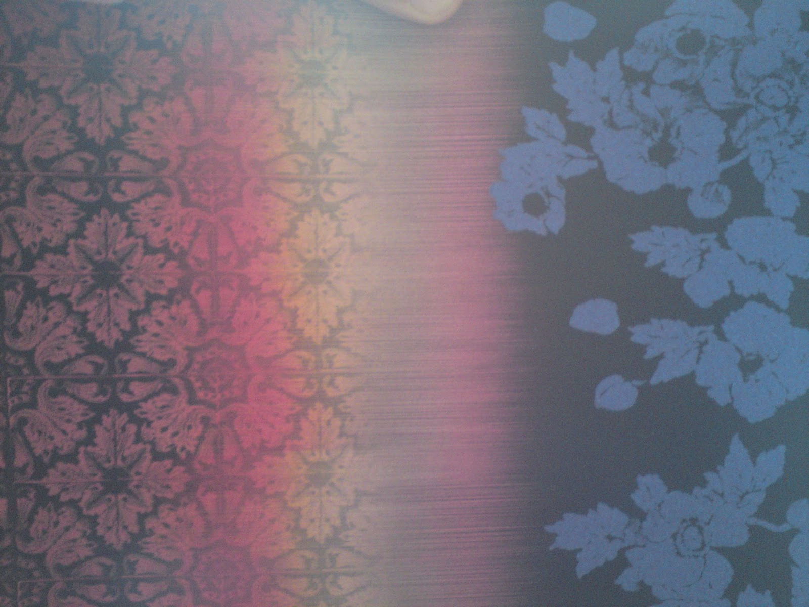
using strong colours like the beautiful red and the blue
which is pale and dark at the same time,
like a shadow upon the black.
They form silhouettes of flowers.
Silhouettes inspired by shadows.
I don't know who she is below. Really I don't.
But the magazine says its Kaya Scodelario so I'll just take its word for it.
Whoever dressed her for the shoot chose a brilliant long sleeve top.
The pattern below is an interesting mix of diamonds,
again a tiled pattern and it sticks to only a limited palette.
I like this limited palette thing of a
few colours you could count on one hand.
But I wish the designer had been more experimental,
instead of falling back onto the white and black tones which,
as everyone should know go with any colour, he/she could have chose
something different.
Sherbet red with a nutty brow? Or the red with some blues?
But then, maybe this way the colours/tones don't distract from the pattern.
A little bit of the scene behind Kaya,
a pretty series of tiles cut to an almond like shape,
reminds me of that motif I can't get out of my head.
A jumper with an interesting knit pattern to it.
Normally I don't take notice of knit, but this one has opened my eyes a little.
The knit has formed a star like shape in a kind of grid form on the rest of the jumper.
Like the simple stars drawn using simple lines at certain angles.

Dogtooth Knitted Jumper @ Topshop
A quick star doodle on artPad

Yet more moody models,
how come in the Matalan leaflet/mini catalogues their models smile?
Another pattern using a diamond form, this time with more colour,
it uses various lines inside the diamond to cause a stir.


Below is another reminder of that irritating motif that I just can't get out of my head.
But it still looks so pretty.
Can you see it?
The four petalled like flower design,
very simple and used for millennia all over the world.
A closer look: it is surrounded by tadpole like lines with crosses in the corners.
Another point, whatever paper they print this magazine on is fantastic.
Unlike glossy magazine paper,
which isn't good for the environment, is hard to recycle
and also makes the magazine hard to grip,
this stuff is on paper.
A good gsm paper, possibly 110gsm or above,
so it can be recycled easily, can be drawn on,
marked on in pencil or whatever implement is at hand.
You can doodle on it. :D