Showing posts with label flowers. Show all posts

Saturday, 19 December 2015

Palette Pin: Purple and Pink and Blue


I love how even the black areas in the palette look dark blue, 
or is it the other way round? 


Zooming out to give you a wonderful view of the print on this fabric
The touches of peach work alongside the pinks is
one of my favourite things about this fabric.

.

Saturday, 28 February 2015

Spring Coming Soon

Spring is coming, it's on the horizon.
The green shoots.


Marie Claire (2011), January 2011, pp unknown

Tuesday, 3 June 2014

Plants and Petals, Bloom Journal, Issue 21

Bloom Journal is a beautiful journal that is, like many journals, expensive - so I scanned in pages from issue 21 last year and finally have come around to posting them. A small preview of Bloom journal, issue 21.


A lot of rich photographs of flowers and brilliant shots of fashion, including a clever fusion of African and Japanese textiles, ideas around fabrics and patterns - something that particularly interests me.

More images from previous Bloom issues can be found here: http://www.edelkoort.com/editions/
Additionally it turns out that Trend publication also have a website called Trend Tablet (http://www.trendtablet.com/), where they post often about things that influence trends/direct trends themselves, with interesting visuals and a nice clean site.


References:
Trend Union. (2013) Bloom journal/magazine (photographs and text), no.21 2013. Various photos and texts, pp. 23,53,67 and 145.
K & M Associates. (2014) Trend Magazines, Bloom Magazine (online). Available at: http://s291360959.initial-website.co.uk/trend-magazines-catalogues/bloom-magazine/. (Accessed: 3rd June 2014).
Trend Union. (2014) About (online). Available at: http://www.edelkoort.com/trend_publication/ (Accessed: 3rd June 2014).

Saturday, 28 December 2013

Flowers scanned


Pressed between book pages and newsprint, all-sorted flowers heads.

Sunday, 15 December 2013

Odd Colours and Leaves

Royal blue and olive green leaves, with these lines that form flower heads and leaves. An interesting colour palette, at first I thought it was awkward and not very nice to look at, but actually after spending time working with the fabric itself the pattern grew on me.  
 

The blue so striking and seems to almost move and glow, whilst the odd touches of a mid green add a little stability.

Saturday, 10 August 2013

Chintz roses; odd colours of pink, red and purple-blue

The chintz pattern has a lot of history and many books written about it.
But here are some chintz patterns that are have been brought to the present,
to the contemporary pattern structures and use of colours.
        
The colour palette is very expressive and bright and warm,
despite fabric having faded through multiple washes,
the colours still strike me as being original.
Especially that strange purple-blue.

These tiny rose buds are beautifully printed onto the fabric,
which is a kind of synthetic blend of materials -
and seems like it would be difficult to print upon.

Monday, 5 August 2013

Archived Snip: Blue flowers and Golden Light

Some found clippings from magazine advertisements:
(Can't remember which one).

This beautiful very simply coloured pale blue on white
presents two different flowers in a repeating pattern
surrounded by stems and leaves. Its hard to tell where the
repeat begins and ends in the original snippet. 
The edge of the cutting presents a nice
picture of real (or maybe fabric/fake?)
flower with the carefully printed floral image
that is either a wallpaper or a vinyl sticker.
In a beautiful kind of rhubarb red/pink.
This damask like pattern is very regal looking - suiting the wedding based advertisement naturally. The rich golds and the lighting of the image seem to show a richness of the pattern that perhaps wouldn't be seen without such effects. the pattern is very Victorianesque.

Friday, 26 July 2013

Black, yellow and flowers

I've recently been going through my sack of textile remnants and pieces and have found that these pieces in particular seem quite odd. Normally I tend to stay clear of black or really dark colours, seeing them as tones or colours to be wary of - as if they are predators. But here I utilised them in a scheme to create interesting contrasts between dullish but bright yellows and creams and the dark blues and blacks of the fabric backgrounds - even taking pieces of suit trousers (worn out) to add to the long rectangular piece.  
A fabric piece I have already blogged about here. It is one of my favourite pieces just because of the way the print is, colours used and the way it tiles in places - where the error of the overlap of the pattern/tile makes the piece all the more memorable. 

Monday, 25 March 2013

Roses and swirls


Both have two 's' in them, and both, construct floral shapes
and at the same time simply decorative lines that can form swirls.
This is an old cutting from a Marks and Spencer Mother's Day advert
in a newspaper years ago.
Originally in colour (the roses were red),
but in greyscale you can pick out the swirling whorling pattern
created by these flowers.  

Monday, 11 March 2013

Flowers, petals and roses


Its strange when scanning dying or dead plants,
the light that is produced for the scanning or copying
process illuminates the parts of the plant
so that it still looks green
when it isn't.
Scans of some petals.


Monday, 9 January 2012

White curls, dots and webs

Ah! First post in 2012, I wonder if there will actually be snow.
I was going through charity shops again,
it is the simplest way to find interesting pattern sources
(what one magpie chucks, is another magpie’s treasure),
and I came across some interesting use of circular motions and motifs.

Take the snail shell like swirl above,
it takes the form of the centre of a flower,
whose petals are marked with stamen like shadows.
 
The neckline of this top makes excellent use of
the continuous chain of circles going from large to small to large again,
with each curve connecting to another through itself or by a tiny circle. 

Friday, 23 December 2011

Pretty Packaging: Herbal Essences

A free sample in Marie Clare, January issue - £2
Such pretty packaging I oculdn't 
resist scanning it into the computer.
This packaging has a great use of colour, 
such a tropical looking blue that has great impact, 
then on top the grunge like marks in silver and green. 
I just looked up what grunge actually means, 
one of its definitions is dirt and grime, 
the other being a type of rock music. 
But now I finally know.
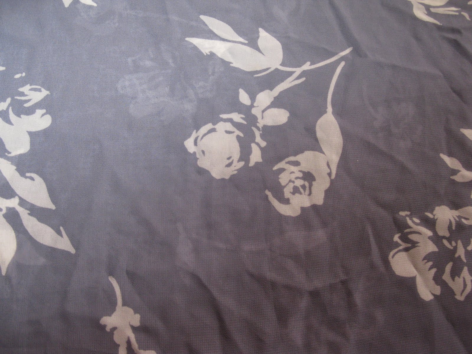
The beautiful flowers adorning the packaging are orchids
and look at the detail of venation and marks on the petals. 
A short post this is, yes, but I'll be collecting some stuff 
to talk about in the next post. 
Oh and the shampoo and conditioner were amazing. 
Smelt lovely too.

Tuesday, 18 October 2011

Orange balloon, black fineliner

At least, I assume its black fine liner.
Any way a friend of mine at university found this piece of balloon in an artist's studio
- originally it was whole.
It's kind of hard to photograph some things,
deflated balloons is now one of them.
From the above image you can see the simple shapes 
forming vines and leaves, and a little butterfly in the centre. 
Amazingly simple, it works best though on top of the bright orange background of a balloon.
And blurred image above - I couldn't resist throwing something blurred in.

Wednesday, 7 September 2011

Silhouettes and grey

And yes,
I know I can't spell,
but I got in the end...
well spell check did.
This fabric is quite thin and translucent so I doubled it,
so that one side would slightly show, very faintly like ghostly motifs
The flowers are roses (I think).
Grey, is a TONE people.
A beautiful tone though, it comes in all sorts of shades
and goes with any colour.

Monday, 5 September 2011

Tulips in Summer

Tulips are the most - well one of the flowers
up there with sunflowers, they just make people smile
(I reserve the right to use my opinions as facts on this blog :D)

The colours looked amazing on this,
sadly I only had a snippet of the fabric to photograph -
just imagine how it looks as a piece of clothing!
I planted tulips months ago...and only one grew T_T
(it was soo pretty though). 

Friday, 2 September 2011

Mirrors, reflection and...SHINEY!

I love photos of threads - yes...seriously,
better then photos of bunnies
(mostly as bunnies are very camera shy).

The thread used in the embroidery seems entwined
with strands of silver reflective colouring - beautiful.
Not forgetting its shiny, SHINY!
(Oh give me a break, I'm a magpie XD)

Alongside the flower and stem embroidery
are little paper thin circular mirrors. More reflection.

The fabric itself has a lovely texture and
is beautiful in this aqua like colour,
with more then a little hint of green.


Sunday, 31 July 2011

Flowers in brown on black

Its amazing how well these dull colours work within the flower shapes, creating a sense of life without so much as a single addition of something bright and bold.
The print itself make a good use of small shapes that build up to create natural organic motifs.

Wednesday, 8 June 2011

A shawl and scarf

Some old photos I took a few years back of a scarf/shawl, originally I intended to use it as research for one of my A Levels..textiles I think, but I never got around to printing them off.