Showing posts with label green. Show all posts

Tuesday, 1 December 2015

Butterfly prints flutterby

 John Lewis Edition Spring 2014?
Only because the dark needs some colour to it
and a lightness to it lines.
Advert for Marccain @ Marie Claire January 2011

Saturday, 28 December 2013

Flowers scanned


Pressed between book pages and newsprint, all-sorted flowers heads.

Monday, 16 December 2013

Colour Archive: Bisazza Mosaico

An A4 advertisement from a forgotten magazine, advertising Bisazza Mosaico,
the luxury tile and glass mosaic designers for interior and exterior decoration.
Nice to know such Artisans still exist.
Their website: http://www.bisazza.com/
(They have music playing in the background.)


Zoomed in, the use of tinted but clear glass works well with 
the sand colours and pretty motifs.


Sunday, 15 December 2013

Odd Colours and Leaves

Royal blue and olive green leaves, with these lines that form flower heads and leaves. An interesting colour palette, at first I thought it was awkward and not very nice to look at, but actually after spending time working with the fabric itself the pattern grew on me.  
 

The blue so striking and seems to almost move and glow, whilst the odd touches of a mid green add a little stability.

Tuesday, 3 December 2013

Pastel green, fresh and minty

Pastel green beads and lots of stitch, the silver chain stitch is particularly pretty
with this hue of green. This edging was re-used,
or at least I have taken the beads to one side to be re-used into something.  


Lots of shots placed together so they line up in places.


Silver, white and light green. Bit of ashame the decorative stitching 
and some beads were loose on this, 
could have just re-used it as it was on some tunic or dress.

Wednesday, 23 October 2013

Clothing Labels: Maximalism and Floral

 
Falmer Heritage
Label @ Matalan
 

Lovely floral motifs which I find are rare on clothing label tags. Really pretty in red with the dark green swirls, all finished off with the grunge effect, giving the label an aged appearance.
Matalan's quality and price are an amazing combination, more often or not their clothing items are made from better cloth (and better stitched), with prices that are almost akin to Primark.
 
 
Denim Co.
Label @ Primark
 
Details on this one are simple, Greece like in motif and the colour is modern and indeed the very image of Primark with its ever colourful items of clothing, items that can be used as layers, leggings, bags and hats and so forth. A thin grey ribbon adds a neat finishing touch on top of the thin semi sheer fabric.
Primark's key to success is maximum sales at lower prices and importantly reacting to the fashion world and its trends of the moment.

Monday, 21 October 2013

Colour Archive: Stylist (unknown issue no, 2012/13)

Magazine online @ http://www.stylist.co.uk/
 
 The pages below, scanned in from the magazine, would make a particularly beautiful desktop or mobile wallpaper (maybe even literal wallpaper for interior design?).
Why not include the text too?
See, this is why I use magazines to collage from, their sources of colour is immeasurable.
Due to the cost of inkjet printing and colour laser printing (which is mind numbingly high), printing sheets and sheets of coloured stuff just seems like madness. In the end using pages from found or bought magazines makes more sense and to sweeten the deal different magazines use different kinds of papers. For example, Stylist uses this soft paper that is like newsprint but much better quality for printing on and unlike its glossy sisters, you can in fact draw, annotate and doodle on the pages.
 
Beautiful Technicolor.
Yes ladies and gents, that is colour spelt the British way :) 


Monday, 30 September 2013

Plastic bags and strawberries

I have always been a fan of strong plastic bags that can be reused. Because of their ability and very green nature, the importance of being used over and over again, they are often given brilliant decorative graphics and colours. 
Sainsbury created a brilliant bag presenting the union jack flag made from a photo of fresh strawberries collaged with blue pieces on a white background.
At one point I was working on this bag to create shapes and patterns of a random dripping nature using glitter glue, which when peeled off the plastic once dried would also peel away the coloured print underneath - leaving only the white plastic.
Remember to re-use your bags.
 

Saturday, 10 August 2013

Chintz roses; odd colours of pink, red and purple-blue

The chintz pattern has a lot of history and many books written about it.
But here are some chintz patterns that are have been brought to the present,
to the contemporary pattern structures and use of colours.
        
The colour palette is very expressive and bright and warm,
despite fabric having faded through multiple washes,
the colours still strike me as being original.
Especially that strange purple-blue.

These tiny rose buds are beautifully printed onto the fabric,
which is a kind of synthetic blend of materials -
and seems like it would be difficult to print upon.

Friday, 19 July 2013

Peices of emulsion 'rock' forms

These kind of look tasty from a distance (if colourful things had food like taste to them),
but they don't smell of anything and feel very chalky - no surprise as I used matt emulsion
paints to make these by pouring emulsion mixed with a little glue onto plastic sheets,
from which the paint pieces then peeled from.  
I define these more as paintings than anything else, their forms are sculptural but their brush like strokes and spills of colours portray the personality of a painting and are reminiscent of colour field painters - with their staining of canvas, where as I have poured colours from tins of emulsion.  


I was hoping to include these in my degree show somehow, preferably making bigger pieces but because of their fragility I decided against it. They are brittle and crumble very easily, even after mixing three parts paint with one part PVA. Needs more experimentation.

Sunday, 26 May 2013

Testing Sumptuous Plum and Teal Tension

Photos form some recent experiments on paper and an old cotton bed sheet,
using emulsion colours from the Dulux range:
The rich teal that becomes more blue than green here
thanks to being watered down and mixed slightly with white.
Bits of Dylon dye powder dropped it begin to absorb the wetness around them.
A 2B pencil drawn set of random lines.
The shiny silver effect upon emulsion is actually quite pretty.
 A bold pink that I have really began to love.
It is a very strong and bold pink - like a hot pink? 
The effect of these strokes is done by putting some white paint down first,
a thick blob that is then brushes out into a line or shape, and then
a bit of a colour on the same brush that is then brushed out on top of the white.
Not too much of the colour otherwise the effect isn't as strong.
Painting on cloth is something that really interests me at the moment -
the way the paint seems to react alongside a material that
rarely carries something so heavy as emulsion or wet ink.
Again white paint is laid out and then some random
splodges of blue are added with a smaller brush.

Thursday, 23 May 2013

Unpicking knits, pilling and colour


I had hoped to re-use this knit but as of yet nothing has been done.
Originally a scarf, I am guessing it was discarded because
it was bubbling up (another term is 'pilling'),
but the colours are still really beautiful and
the wool itself is soft with a nice
golden metallic thread running through it.  

Tuesday, 2 April 2013

Light colours and organic forms


I took these scraps from various interior catalogues.
Where there is a bit of pattern, it is broken up by layers of light colours.
The organic forms of brambles and holly
play with these muted hues of blues and greens beautifully.
 
I couldn't help but include a random bit of pink.
Like a ribbon.

Monday, 9 July 2012

Vintage Clip-Ons (Accessories)


Vintage earrings and clip ons found at the Vintage fair in Newcastle:

A very delayed post but it is here.
Back at the vintage Fair in May I noticed how commonplace vintage clip ons were, clearly a type of thing that was popular at this time as in shops now there tends to just be earrings or studs that fit an ear piercing.
I know incredibly little about vintage wares, but these really interested me:
Above a great selection of all kinds of clip ons, most of which seemed shape derrived from this flower like shape with between 5-8 points, some in shapes of hexagons, heptagons and octagons - creating beautiful shiny bloomage.
A few close ups of my favourites:
.
This pair form a star like shape, tapered of with points creating the octagon shape. The choice of blues is particularly interesting, one being pale and the other light - maybe they were meant to appear to be stars?
The brooch is particularly interesting with its glaze over the center that creates a boiled sweet like appearance and that beautiful border.

Below the slightly off white lines remind me of icing and the shapes themselves seem to imitate netting or lace of some kind. These would be my favourite simply with this reference to fabric.  


The abundance in usage of beads in the photos is pretty sweet, it has been rare for me to see such beautiful arrays of earrings with such a high standard of design and look using beads to construct and define.

Tuesday, 29 May 2012

Stacks, Layers and Vintage

Again more photos from May's Vintage Fair in Newcastle.
Just some interesting combinations of line
and colour that caught my eye really.

Going form one colour to the next - with an assortment of shades.

And of course  some vintage scarves,
mostly made from sheer translucent fabrics
and some of chiffon or silky smooth, thin and soft fabrics.
Each scarf represents a time or a year
when particular patterns were common and well received.

Monday, 21 May 2012

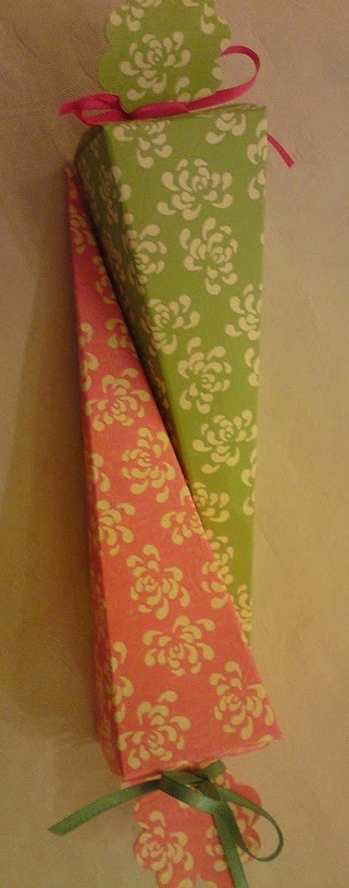
Wedding sweets, pink and green

Yum yum.
Especially the mix of the grapefuit like pink
and that nice cool green.
The flower shapes I think are stylised chrysanthemums flowers,
very nice pattern work.
And lets be honest,
everyone likes ribbons.
For those who don't know what houses weddings sweets can be anything,
often using interesting folding techniques or fabric.

Monday, 2 April 2012

Book cover all Stitched

I found this book in the library recently.
Didn't have a chance to look inside so
I went and judged it by its cover instead.
I think it's brilliant!
Book reference:
Campana, F., Campana, H. (2010) Campana Brothers: Complete Works (So Far). Brazil: Rizzoli International Publications
The use of machine stitch is what really works well,
upon this forest green and the simple, but bold, dark blue lettering
its not surprising that reviews on amazon show it to be
an excellent book on the furniture design brothers.
It harnesses the machine running stitch.
One that is simple, but in it is a pattern
of one stitch then a group of thin stitches overlaid upon each other.
Sometimes simple works best when mixed with a little detail -
if it had just been a running stitch I may not have been as impressed by it
and nor would it hasve been as innovative.
Its like they have created a new stitch pattern -
or brought back an old one for a viewing.

Monday, 19 March 2012

MS Bing


I like Bing now.
Dtae captured: 6th February 2012
Don’t get me wrong I hate how when you sign out of Hotmail your taken to a lumpy collage mess of  gossip and news, known as the MSN page.
But Microsoft’s search engine, given its make over once a day with a beautiful photo of something, anything – be it a plants, a building, some kind of macro photo, or even a short cute video of a group of seals chillin with their mates, is well worth the aggravation of changing from googling to…well binging. But I still google. Its a hard habit to kick.
Dtae captured: 11th November 2011
Any way a selection of screenshot saves in which pattern poses a great threat to me using google. I mean next to cuteoverload.com Bing’s cover page can cheer me up. Its great. And those little glowing squares of facts are just a perfect addition. 
Dtae captured: 9th December 2011