Monday 31 October 2011

Red and Blue: A poster inventive thing

A poster found on the way home.
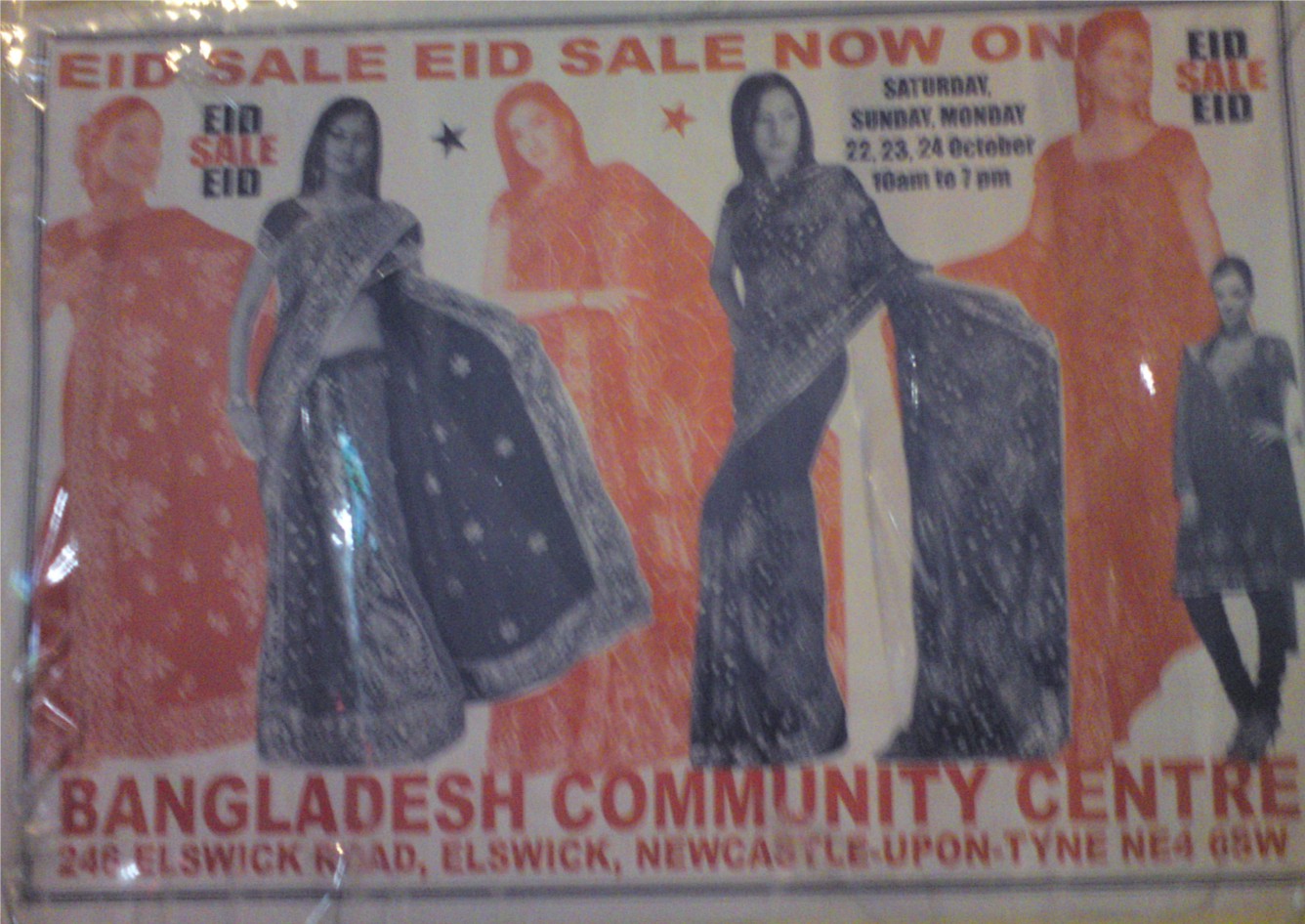
 It was high up for me, so it was hard to take a steady photo.
Any way I really liked how whoever designed and printed it
ensured that the models came out in red and then blue,
alternating between these two colours.
The clothing worn is commonly known is a sari (in case you didn't know),
I've done a little research on it, and so far I know it is made up of mainly three parts:
- the sari itself (which is a long length of fabric)
- the blouse
- the petticoat which is a long skirt like part that the sari part completely covers.
A sari has an interesting definition or style of patterning, 
they often have great intricate borders of natural motifs or geometric shapes amongst other things.
Then inside this border is a less detailed pattern, 
but something that matches the border.
These designs looked stunning when I saw them,
a mix of flower and plant drawing like forms
with another sari next to it with beautiful geometric designs.


(2011) Eid Sale Now On (Bangladesh Community Centre). Seen on 28th October 2011

Saturday 29 October 2011

Spots - and not Spot the dog, though he is adorable.

They kind of remind me of giraffe like polygons, but here they are more more round, and more graphic too - if you see the black stripy parts that almost cling onto the peachy brown areas.

Thursday 27 October 2011

Ever present influences

Pages from Marie Clare October 2011 issue.

Ever present being the polka dot, or the dot, or the circle,
which ever word you use to describe or name or classify it.
It is every where, liek thel ine then if you think about it.
What most interests me with this spread is the interesting colour combinations,
always coming in twos and sticking to at least one fairly bold colour.
There is clearly a sense of constant with the dot.

Moving onto the Aztec inspirations of the moment,
I haven't seen much of it myself on the street - except on jumpers I think.
But I'm looking forward to seeing more of the Aztec's infleucneing through pattern,
their own ideas of pattern are individual and unique.
Incredibly defined by straight lines, angles and points and geometric shapes.
The use of the diamond, or square pushed to one side a little,
features heavily in the clothes on these pages.
Colours are solid, bright and bold,
with black left to make its defining place.

Saturday 22 October 2011

214 - Topshop's Own


Thanks are due to Liz who actually handed me the magazine saying I'd love it.
She was right.

Above is the interesting cover, a usual shot of a moody looking model,
but what is that she is wearing?
Is it a beautifully patterned dress (well of course - it wouldn't be here otherwise).

As you can see above this is the back page of Topshop's Autumn/Winter edition of 214.
I have to admit, they know their patterns.
The tiling is perfect and sustains an edge of contemporary appearance,
using strong colours like the beautiful red and the blue
which is pale and dark at the same time,
like a shadow upon the black.
They form silhouettes of flowers.
Silhouettes inspired by shadows.
I don't know who she is below. Really I don't.
But the magazine says its Kaya Scodelario so I'll just take its word for it.
Whoever dressed her for the shoot chose a brilliant long sleeve top.
The pattern below is an interesting mix of diamonds,
again a tiled pattern and it sticks to only a limited palette.
I like this limited palette thing of a
few colours you could count on one hand.
But I wish the designer had been more experimental,
instead of falling back onto the white and black tones which,
as everyone should know go with any colour, he/she could have chose
something different.
Sherbet red with a nutty brow? Or the red with some blues?
But then, maybe this way the colours/tones don't distract from the pattern.
A little bit of the scene behind Kaya,
a pretty series of tiles cut to an almond like shape,
reminds me of that motif I can't get out of my head.
A jumper with an interesting knit pattern to it.
Normally I don't take notice of knit, but this one has opened my eyes a little.
The knit has formed a star like shape in a kind of grid form on the rest of the jumper.
Like the simple stars drawn using simple lines at certain angles.

Dogtooth Knitted Jumper @ Topshop
A quick star doodle on artPad

Yet more moody models,
how come in the Matalan leaflet/mini catalogues their models smile?
Another pattern using a diamond form, this time with more colour,
it uses various lines inside the diamond to cause a stir.


Below is another reminder of that irritating motif that I just can't get out of my head.
But it still looks so pretty.
Can you see it?
The four petalled like flower design,
very simple and used for millennia all over the world.
A closer look: it is surrounded by tadpole like lines with crosses in the corners.
Another point, whatever paper they print this magazine on is fantastic.
Unlike glossy magazine paper,
which isn't good for the environment, is hard to recycle
and also makes the magazine hard to grip,
this stuff is on paper.
A good gsm paper, possibly 110gsm or above,
so it can be recycled easily, can be drawn on,
marked on in pencil or whatever implement is at hand.
You can doodle on it. :D

Thursday 20 October 2011

Internet findings: mein motif - pedro oyarbide:


Normally I only post once every other day, but I've plans to change this a little whenever I see something on the Internet relating to pattern, that I really like and think is worth showing people - or on the other hand that I really hate and think should have a wanted dead or alive poster up for it.

Today I've been exploring:
mein motif - pedro oyarbide: (a blogger blog)

In this case, I admire Pedro Oyarbide's work, especially how he goes about putting it out there in the form of a project blog which takes dedication (trust me ask any regular blogger) to post in it everyday. To have to come up with a pattern that is different to those previously posted, every day. An impressive feat of determination.

Almost had an image free blog post there. Ouch

Pedro Oyarbide's patterns take on a note of experimentation, which obviously you'd have to do to be putting up every day. In some you can see how they are related to previous ones or future ones once posted, and though some still might need refining, they still look amazing - a staggering piece of imagination flowed into shape and colour.

An example:
Day 27 and Day 26
Both of which share this brilliant diamond shape that has a neat little bit of ornamentation like work on two of its sides.

I'll say no more, but you should check out his blog, if its the only non facebook/twitter thing you do today.

Tuesday 18 October 2011

Orange balloon, black fineliner

At least, I assume its black fine liner.
Any way a friend of mine at university found this piece of balloon in an artist's studio
- originally it was whole.
It's kind of hard to photograph some things,
deflated balloons is now one of them.
From the above image you can see the simple shapes 
forming vines and leaves, and a little butterfly in the centre. 
Amazingly simple, it works best though on top of the bright orange background of a balloon.
And blurred image above - I couldn't resist throwing something blurred in.

Sunday 16 October 2011

Victorian Design and Ornament - and I didn't have to do any research to find that out

I feel like I should have referenced this book Harvard style.
Any way here is what I got from Amazon:
Meyer's Ornament - Victorian Bible of Design by Frank Sales Meyer
In the library bookshelf above,
and got some pretty graphic golden lines below.
The 'O' in Ornament on the spine is known as illuminated text.
One of the earliest texts found with illuminated text is The Book of Hours.
A quick Google search of this will give you a wealth of words and images. 
Blogger likes to rotate images no matter which camera I use,
I'm going to get to the bottom of this though.
The image in the corner here uses typical Victorian ornamental imagery.
The vine like lines that seem to have an attitude of movement about them, 
almost like a clock face with the interruption of the 
golden blocks that seem to divide the circular motif into pieces. 

Friday 14 October 2011

Above door decor - and the ryme thrown in for fun

On the way home one afternoon
I had to stop at this little bit of intricate (I believe metal work).
Photos are a bit blurry as this bit of work is situated above a door,
like a kind of mantel piece to a door actually.
The shapes and forms are clearly Victorian stylised motifs and shapes,
which twist and wind and curl around each other.

Wednesday 12 October 2011

Eye-holes on shutters at 'Reid & Sons'

I'm not one for jewlery (at the moment),
except for clever studs and of course bangles,
but I seem to be drawn to a jewellers windows much like any other person.
Again most likely because of my magpieism (attracted to sparkly and shiny things).
I think this clever way of closing shutters on the shop, helping to not entice prospective theives, but still including groupings of dots cut out of the shutters,
which really should just entice prospective customers to have a closer look.    
Or at least it succeeded in doing that to me...

Monday 10 October 2011

Printed and padded chair - comfy.

No fair! Sculpture students get pretty chairs that are 
nice and soft and not a trace of plastic in sight on em.
Oh, hang on, I managed to snag myself one of those new comfy chairs
from that pile of em next to the lifts...so really why am I complaining again?
Oh yes, because mine isn't patterned like this one is.
I wonder if this pattern was the original part
of the fabric on the chair, or added by a genius art student...

Saturday 8 October 2011

Furniture - to be dumped

I know what your thinking...
no, I didn't put it outside university to be skipped,
that was someone else and no doubt for good reasons.
First obvious one was that the cupboard was lacking a door.  
That little doodled motif looks pretty,
commonplace and medieval like,
but it looks good where it is.

Thursday 6 October 2011

Shiny and purple. Could it get better?

Well yes probably, it's a lovely shade of plum like purple.
Yum. Plum, coincidence that it rhymes?
Purple has been a colour I've been drawn to like,
well I suppose a rusty stubborn magnet.
Silvery coloured bits, which I'd keep away from the iron in case they melt.
Silver goes with everything and anything....
just be careful you don't end up looking like something from a Christmas nativity story.

Tuesday 4 October 2011

QR codes - so much more than a URL.

I've only just begun to use the wifi on my phone
despite having it for a year,
and began to get attached to using these QR codes,
with a few questions on my mind,
so I've researched and answered the main ones.
I did the research on my mobile, at night...thank you wifi
(you monstrous thing that now I'm addicted to using).
Above an example of a QR code I found in September's
issue of novel, a local Newcastle based magazine that has just started up. 
They make interesting blocks of pattern. 
As there is only one photo today, have a look at a Bing images search.

What does QR stand for?
 QR stands for quick response,
and is a type of code that has been around since 1994,
well before the Internet became so widely used and recognised.

QR started life as a way of tracking parts made by Denso Wave,
an arm of Toyota
and is a type of 2D bar code that is designed to be read at high speeds.

So far I have seen it used on business cards,
flyer's, posters and mostly in magazines or newspapers.
It has further possibilities in marketing which have yet to be discovered and researched.

Barcodes have a maximum of 20 characters in them whilst QR codes have 7089
Barcdoes can only be read horizontally where as QR codes can be read horizontally and vertically.


Research links:
Who Cares About QR codes? (Author: Betty Adamou)
QRcode.com (Site owned by Denso Wave)

Sunday 2 October 2011

New Diary from Paperchase


It would be a dream to sell work to Paperchase for them to
give money in return and then in turn,
turn that work into something adorning something as handy as a diary.
Admittedly I have a few months empty, from July to most of September,
but I can use that for extra notes space.
Not a bad price, and made in the UK,
felt pretty good about that last point.

Since my A levels I have grown a good attachment to spiral bound books.
Sketchbooks that are spiral bound are especially handy. 
The plastic cover is translucent, great fun with colour and shapes.
The beautiful swirls are reminiscent of Art Decor and the Arts and Crafts movement
Great times.
Red cardi put behind the back cover.
A slight tremor of my arm,
purposefull tremor of course.
Putting the small Paperchase bag under the cover is
quite an interesting blend of line and shape, more vertical darker shapes.