Showing posts with label yellow. Show all posts

Thursday, 19 November 2015

Blue skies, rain and denim

Then orange, then pink, so denim splurge.

John Lewis Edition (unknown)
Marie Claire. January 2011, pp. unknown


Embroidery on denim too is something that really fascinates me at the moment, 
some of my own embroidery below:

Testing out watercolour brush in MS Paint - nice texture, really irritating point/beginning of it though. If it was a gimp moving brush maybe that would be better? Blues abundance. 


John Lewis Edition Spring 2014/2013, pp. unknown


References:
John Lewis Edition. Spring 2013/2014, pp. unknown
Marie Claire. Spring/Summer 2013, pp. unknown

Thursday, 5 June 2014

Blue masks, dots and diamonds

A fabric piece that I am working with at the minute, patching it with white pieces of similarly stretchy fabric to create larger pieces, originally an old trouser kindly donated.

 
The pattern looks quite aggressive up close. Like masks all bunched together to scare off irritating people? Brilliant range of blues on the fabric that are hard to capture using a scanner or camera. Quite pretty with the lilac bit of paint I dropped on the corner. 

Saturday, 28 December 2013

Flowers scanned


Pressed between book pages and newsprint, all-sorted flowers heads.

Monday, 16 December 2013

Colour Archive: Bisazza Mosaico

An A4 advertisement from a forgotten magazine, advertising Bisazza Mosaico,
the luxury tile and glass mosaic designers for interior and exterior decoration.
Nice to know such Artisans still exist.
Their website: http://www.bisazza.com/
(They have music playing in the background.)


Zoomed in, the use of tinted but clear glass works well with 
the sand colours and pretty motifs.


Sunday, 15 December 2013

Odd Colours and Leaves

Royal blue and olive green leaves, with these lines that form flower heads and leaves. An interesting colour palette, at first I thought it was awkward and not very nice to look at, but actually after spending time working with the fabric itself the pattern grew on me.  
 

The blue so striking and seems to almost move and glow, whilst the odd touches of a mid green add a little stability.

Friday, 13 December 2013

Postcards: the last of an old species of written word

Source: Post cards/promotional material from mid 2000s for
My So-Called Life (The Tragically Normal Diary of Rachel Riley)
By Joanna Nadin


Not actually read this book and probably never will at the rate its taking me to read my way through some books, but the covers of the postcards I found are bold and amusing, with soft mellow colours and swirls. I am going through a bit of a swirl doodling obsession at the moment, so though this doesn't help with that, at least it fuels it (in felt tip like colours).

Wednesday, 23 October 2013

Clothing Labels: Maximalism and Floral

 
Falmer Heritage
Label @ Matalan
 

Lovely floral motifs which I find are rare on clothing label tags. Really pretty in red with the dark green swirls, all finished off with the grunge effect, giving the label an aged appearance.
Matalan's quality and price are an amazing combination, more often or not their clothing items are made from better cloth (and better stitched), with prices that are almost akin to Primark.
 
 
Denim Co.
Label @ Primark
 
Details on this one are simple, Greece like in motif and the colour is modern and indeed the very image of Primark with its ever colourful items of clothing, items that can be used as layers, leggings, bags and hats and so forth. A thin grey ribbon adds a neat finishing touch on top of the thin semi sheer fabric.
Primark's key to success is maximum sales at lower prices and importantly reacting to the fashion world and its trends of the moment.

Monday, 21 October 2013

Colour Archive: Stylist (unknown issue no, 2012/13)

Magazine online @ http://www.stylist.co.uk/
 
 The pages below, scanned in from the magazine, would make a particularly beautiful desktop or mobile wallpaper (maybe even literal wallpaper for interior design?).
Why not include the text too?
See, this is why I use magazines to collage from, their sources of colour is immeasurable.
Due to the cost of inkjet printing and colour laser printing (which is mind numbingly high), printing sheets and sheets of coloured stuff just seems like madness. In the end using pages from found or bought magazines makes more sense and to sweeten the deal different magazines use different kinds of papers. For example, Stylist uses this soft paper that is like newsprint but much better quality for printing on and unlike its glossy sisters, you can in fact draw, annotate and doodle on the pages.
 
Beautiful Technicolor.
Yes ladies and gents, that is colour spelt the British way :) 


Friday, 26 July 2013

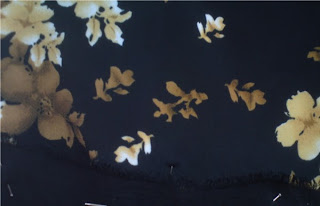
Black, yellow and flowers

I've recently been going through my sack of textile remnants and pieces and have found that these pieces in particular seem quite odd. Normally I tend to stay clear of black or really dark colours, seeing them as tones or colours to be wary of - as if they are predators. But here I utilised them in a scheme to create interesting contrasts between dullish but bright yellows and creams and the dark blues and blacks of the fabric backgrounds - even taking pieces of suit trousers (worn out) to add to the long rectangular piece.  
A fabric piece I have already blogged about here. It is one of my favourite pieces just because of the way the print is, colours used and the way it tiles in places - where the error of the overlap of the pattern/tile makes the piece all the more memorable. 

Thursday, 23 May 2013

Unpicking knits, pilling and colour


I had hoped to re-use this knit but as of yet nothing has been done.
Originally a scarf, I am guessing it was discarded because
it was bubbling up (another term is 'pilling'),
but the colours are still really beautiful and
the wool itself is soft with a nice
golden metallic thread running through it.  

Monday, 1 April 2013

Geometrics and the red telephone box


Old red telephone box.
Black and white dots.
Golden-yellow lines and boxes.

A part of a series of collages I made last year.
Looking at both colour and geometric shapes that bring together a strange kind of theme to the collage.


Monday, 11 March 2013

Flowers, petals and roses


Its strange when scanning dying or dead plants,
the light that is produced for the scanning or copying
process illuminates the parts of the plant
so that it still looks green
when it isn't.
Scans of some petals.


Saturday, 11 August 2012

Sequinned Chunky Heels

I found these one day when looking through the sale section of T.K.Max at the Metro Center in Gateshead (UK). I was fascinated by how sequins have seemingly for me, moved form coloured to transparent, upon which behind is a print of some kind. Just imagine the possibilities of this - perhaps even tinted sequins on top of a colour or black and white print. Any way I'll be digging out some interesting sequins and beads to post up when I have a chance.
See through sequins are incredibly popular for girl and women's wear at the moment, 
both on clothes and shoes - especially t-shirts and flat ballerina style shoes.
But these caught me as something much more different,
the shoes are in fact heeled and are slipper like when putting them on.
Oh and they come in a freakishly small foot size XD - considering the size of them.
Of course sequins themselves, not just particular colours or shades of them
have always been fairly popular and on trend, and not just on foot-ware. 

The Greeks are known to have used their own coinage as sequins,
drilling holes into them and threading them onto their shoes.
Info from here
[http://damojackson.hubpages.com/hub/Sequin-Shoes]
Of course sequins now in the present are made of plastic,
are disposable, and come in hundreds of different colours and shapes,
not just the original circle shiny thing.
These brass circular button like things on running on the sides are quite an interesting detail.
I'm thinking these shoes may be puma made but unsure as these weren't tagged very well. 
But the fine small flowers on repeat were quite dinky, 
reminding me of the ballerina shoes that Primark and other shops have had in for the past year or so.
with the interesting flower motifs.
The most well known pair of sequinned shoes are the many pairs worn in
The Wizard of Oz (1939, MGM Studios) by the actress Judy Garland
who played Dorothy. These shoes have a small heel to them and
were decorated additionally with butterfly bows encrusted
with either tiny jewels or cheap glass beads of sorts.
The slippers themselves were designed by Gilbert Adrian,
at that time he was a known costume designer for MGM studios.
Info from here.
[http://en.wikipedia.org/wiki/Ruby_slippers]


Thursday, 2 August 2012

Found Wrapping Bears and Cute Papers

Ok so this sort of stuff is twee. I know.
But look at how the repeats at the papers edges create
brilliant vertical lines of colour that seem to waver.
I had a fiddle on Gimp with the colour as my camera
struggles with whites and greys on images such as this,
where the background is white and uploaded it here
The repetition effect is the most appealing this to this wrapping paper,
personally I love repetition, its a building block to pattern, kind of part of its DNA.
I really need to do my research as I don't know who produced or created this wrapping paper.

Wednesday, 4 April 2012

Bus Stops and Fashion

Who would have thought it?
They go together so well -
or at least the bus stops I've seen have managed to
co exist with their adverts nicely. 
These are ones in Town near the city library:

H&M know how to make pattern and print look amazing.
Enough said.


Detailed paisley, a very chintzy styled pattern -
and when I say chintzy I mean in terms of pattern
and not in colour -
as here the colours are almost acidic,
very warm and bright.


Next top by H&M has this beautiful embellished around neckline,
studded with fake glass gems.


The head wrap or sash or scarf (multipurpose - who knew?)
also shares the paisley motifs scattered across it.
Using pinks as well.
I got far too distracted by these bus stops. 

Monday, 2 April 2012

Book cover all Stitched

I found this book in the library recently.
Didn't have a chance to look inside so
I went and judged it by its cover instead.
I think it's brilliant!
Book reference:
Campana, F., Campana, H. (2010) Campana Brothers: Complete Works (So Far). Brazil: Rizzoli International Publications
The use of machine stitch is what really works well,
upon this forest green and the simple, but bold, dark blue lettering
its not surprising that reviews on amazon show it to be
an excellent book on the furniture design brothers.
It harnesses the machine running stitch.
One that is simple, but in it is a pattern
of one stitch then a group of thin stitches overlaid upon each other.
Sometimes simple works best when mixed with a little detail -
if it had just been a running stitch I may not have been as impressed by it
and nor would it hasve been as innovative.
Its like they have created a new stitch pattern -
or brought back an old one for a viewing.

Monday, 19 March 2012

MS Bing


I like Bing now.
Dtae captured: 6th February 2012
Don’t get me wrong I hate how when you sign out of Hotmail your taken to a lumpy collage mess of  gossip and news, known as the MSN page.
But Microsoft’s search engine, given its make over once a day with a beautiful photo of something, anything – be it a plants, a building, some kind of macro photo, or even a short cute video of a group of seals chillin with their mates, is well worth the aggravation of changing from googling to…well binging. But I still google. Its a hard habit to kick.
Dtae captured: 11th November 2011
Any way a selection of screenshot saves in which pattern poses a great threat to me using google. I mean next to cuteoverload.com Bing’s cover page can cheer me up. Its great. And those little glowing squares of facts are just a perfect addition. 
Dtae captured: 9th December 2011

Sunday, 19 February 2012

Connect the dots…

Or join the dots, as I fondly recall, were actually, 
as opposed to word searches which were honestly like some kind of form of kiddy torture.
If you’ve been bad, a word search, and if good, a join the dots.
Or at least the was my first impression.
It was a bag found in one of the cheap bag cages at the back of the shop, I didn’t buy the bag obviously, I mean it didn’t look very sturdy, but the surface print was just so interesting I had to have a good look. Snuck in a few photos too. 
The forms are fairly abstract but clearly butterfly like in shape, and some looking like flowers or petals, made out of this strange cross hatching and black simplified petal shapes.
A closing note this interesting scale like pattern
made from petal like shapes with this 
cross hatching that is reminiscent of netting and structures of grids.