Showing posts with label floral. Show all posts

Saturday, 19 December 2015

Palette Pin: Purple and Pink and Blue


I love how even the black areas in the palette look dark blue, 
or is it the other way round? 


Zooming out to give you a wonderful view of the print on this fabric
The touches of peach work alongside the pinks is
one of my favourite things about this fabric.

.

Tuesday, 3 June 2014

Plants and Petals, Bloom Journal, Issue 21

Bloom Journal is a beautiful journal that is, like many journals, expensive - so I scanned in pages from issue 21 last year and finally have come around to posting them. A small preview of Bloom journal, issue 21.


A lot of rich photographs of flowers and brilliant shots of fashion, including a clever fusion of African and Japanese textiles, ideas around fabrics and patterns - something that particularly interests me.

More images from previous Bloom issues can be found here: http://www.edelkoort.com/editions/
Additionally it turns out that Trend publication also have a website called Trend Tablet (http://www.trendtablet.com/), where they post often about things that influence trends/direct trends themselves, with interesting visuals and a nice clean site.


References:
Trend Union. (2013) Bloom journal/magazine (photographs and text), no.21 2013. Various photos and texts, pp. 23,53,67 and 145.
K & M Associates. (2014) Trend Magazines, Bloom Magazine (online). Available at: http://s291360959.initial-website.co.uk/trend-magazines-catalogues/bloom-magazine/. (Accessed: 3rd June 2014).
Trend Union. (2014) About (online). Available at: http://www.edelkoort.com/trend_publication/ (Accessed: 3rd June 2014).

Monday, 9 December 2013

White Hibiscus and the Blue

Originally fabric I have used in some past pieces of artwork. I scanned in some of the largest parts of it before actually working with the material, simply because the pattern is gorgeous.
I've just started noticing the way the leaves swirl in on themselves. 


The slight pink at the top middle is where I spilt some dylon dye. 
This is just one of them, the quality is quite poor to save up on room. I always worry about running out, and having to go through all the scans and photos on my Google Picasa account.
Resort to Photobucket maybe?

Friday, 23 August 2013

Floral lace scans in b&w

Some lace scans. Originally the lace came form a t-shirt like top I bought from a charity shop in town. The floral pattern on the top can be found on a previous post titled Chintz roses; odd colours of pink, red and purple-blue.
I haven't yet got a chance to use these pieces in any painting or work, but I used the rose print top part in my degree show exhibition as an appropriation of the typical floral patterns now commonly seen on the streetwalk and catwalk. A pattern that has been brought back out of the cupboards and dusted off, then given a pat down with modernisation - as has lace or lace imitation fabrics of course.
Thinking of doing a lace feature of prints/scans/photos for September.
So please by all means send in photos/scans of lace or bits of lace form anything via e-mail to patternandsurface@gmail.com  
 

Saturday, 10 August 2013

Chintz roses; odd colours of pink, red and purple-blue

The chintz pattern has a lot of history and many books written about it.
But here are some chintz patterns that are have been brought to the present,
to the contemporary pattern structures and use of colours.
        
The colour palette is very expressive and bright and warm,
despite fabric having faded through multiple washes,
the colours still strike me as being original.
Especially that strange purple-blue.

These tiny rose buds are beautifully printed onto the fabric,
which is a kind of synthetic blend of materials -
and seems like it would be difficult to print upon.

Monday, 5 August 2013

Archived Snip: Blue flowers and Golden Light

Some found clippings from magazine advertisements:
(Can't remember which one).

This beautiful very simply coloured pale blue on white
presents two different flowers in a repeating pattern
surrounded by stems and leaves. Its hard to tell where the
repeat begins and ends in the original snippet. 
The edge of the cutting presents a nice
picture of real (or maybe fabric/fake?)
flower with the carefully printed floral image
that is either a wallpaper or a vinyl sticker.
In a beautiful kind of rhubarb red/pink.
This damask like pattern is very regal looking - suiting the wedding based advertisement naturally. The rich golds and the lighting of the image seem to show a richness of the pattern that perhaps wouldn't be seen without such effects. the pattern is very Victorianesque.

Friday, 26 July 2013

Black, yellow and flowers

I've recently been going through my sack of textile remnants and pieces and have found that these pieces in particular seem quite odd. Normally I tend to stay clear of black or really dark colours, seeing them as tones or colours to be wary of - as if they are predators. But here I utilised them in a scheme to create interesting contrasts between dullish but bright yellows and creams and the dark blues and blacks of the fabric backgrounds - even taking pieces of suit trousers (worn out) to add to the long rectangular piece.  
A fabric piece I have already blogged about here. It is one of my favourite pieces just because of the way the print is, colours used and the way it tiles in places - where the error of the overlap of the pattern/tile makes the piece all the more memorable. 

Wednesday, 24 July 2013

Swirls, twists and silver

This is a small piece of a wallpaper sample I got from B&Q a while back, known as Laurence Llewelyn-Bowen Cote Couture Wallpaper. 
I picked it solely because of its use of pattern, the damask type of patterns found on fabric where two types or thread are use to create a pattern within the very surface of the fabric.
 
The choice of tone and metallic colour is particularly interesting as it seems to refer to how in traditional damask fabrics, often one thread would be shiny whilst the other would be dull, presenting a pattern that would be shiny, standing out against the dull coloured surface. . 
The damask is made up of floral shapes, petals, leaves - shapes often called paisley motifs as well as vines and other kinds of twists. The paisley itself has particular reference to the Greek motif of a tear drop
The wallpaper itself is not the best kind in terms of practicality, it rips and gets scuff marks quite easily; not the most hard wearing of wallpapers. 

Friday, 1 March 2013

Newspaper Snip: Flowers and leaves

From the front cover of:
The Independent, Independent Traveller insert (Saturday 5th January) [Front page photo]

Wednesday, 4 April 2012

Bus Stops and Fashion

Who would have thought it?
They go together so well -
or at least the bus stops I've seen have managed to
co exist with their adverts nicely. 
These are ones in Town near the city library:

H&M know how to make pattern and print look amazing.
Enough said.


Detailed paisley, a very chintzy styled pattern -
and when I say chintzy I mean in terms of pattern
and not in colour -
as here the colours are almost acidic,
very warm and bright.


Next top by H&M has this beautiful embellished around neckline,
studded with fake glass gems.


The head wrap or sash or scarf (multipurpose - who knew?)
also shares the paisley motifs scattered across it.
Using pinks as well.
I got far too distracted by these bus stops. 

Monday, 10 October 2011

Printed and padded chair - comfy.

No fair! Sculpture students get pretty chairs that are 
nice and soft and not a trace of plastic in sight on em.
Oh, hang on, I managed to snag myself one of those new comfy chairs
from that pile of em next to the lifts...so really why am I complaining again?
Oh yes, because mine isn't patterned like this one is.
I wonder if this pattern was the original part
of the fabric on the chair, or added by a genius art student...

Saturday, 8 October 2011

Furniture - to be dumped

I know what your thinking...
no, I didn't put it outside university to be skipped,
that was someone else and no doubt for good reasons.
First obvious one was that the cupboard was lacking a door.  
That little doodled motif looks pretty,
commonplace and medieval like,
but it looks good where it is.

Thursday, 6 October 2011

Shiny and purple. Could it get better?

Well yes probably, it's a lovely shade of plum like purple.
Yum. Plum, coincidence that it rhymes?
Purple has been a colour I've been drawn to like,
well I suppose a rusty stubborn magnet.
Silvery coloured bits, which I'd keep away from the iron in case they melt.
Silver goes with everything and anything....
just be careful you don't end up looking like something from a Christmas nativity story.

Wednesday, 7 September 2011

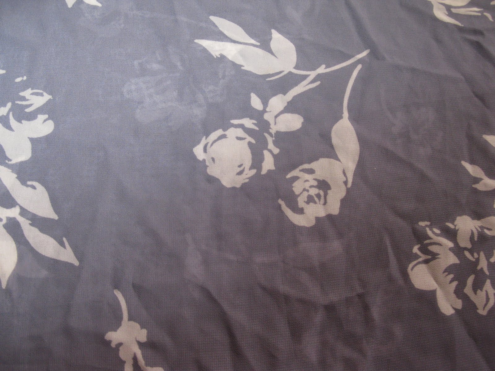
Silhouettes and grey

And yes,
I know I can't spell,
but I got in the end...
well spell check did.
This fabric is quite thin and translucent so I doubled it,
so that one side would slightly show, very faintly like ghostly motifs
The flowers are roses (I think).
Grey, is a TONE people.
A beautiful tone though, it comes in all sorts of shades
and goes with any colour.

Wednesday, 8 June 2011

A shawl and scarf

Some old photos I took a few years back of a scarf/shawl, originally I intended to use it as research for one of my A Levels..textiles I think, but I never got around to printing them off.