Showing posts with label plastic. Show all posts

Friday, 18 April 2014

Archived Snip: Alexis Bittar, bracelets and bangles

Beautiful bits of jewellery mixed with walls cracking and crumbling. 
This jewellery designer is pretty clever and amazing with his variety of bracelets and bangles.
Not a single rough or sharp edge, the jewellery shapes often takes exaggerated forms, tubular and always so beautiful. They have an edge of other worldliness about them that I find fascinating, I think its his use of kind of frosted materials, or materials with a translucency to them.
Lucite, a material used to form the some of the bangles and bracelets he makes, is a type of thermoplastic which is known and used as a shatter-resistant alternative to glass, a material traditionally associated with bangles due to the way glass clinks and makes sounds when bumping or hitting each other - like bells? Plastic bangles don't share this sound, their more clunky really in that respect, but their safer and stronger than glass. Lucite is also known as perspex or acrylic.    


References:
Alexis Bittar (2014) Alexis Bittar. Available at: http://www.alexisbittar.com/ (Accessed:15th April 2014).

Ellis, K. (2009) 'Alexis Bittar Crystal Bangles', The Gloss, 1st November. Available at: http://www.thegloss.com/2009/11/01/fashion/alexis-bittar-crystal-bangles/ (Accessed:15th April 2014).

Scottsdalefashionista (2012) 'Flower power ! Don’t miss Alexis Bittar’s spring jewelry trunk show at Nordstrom !', 19th April (Online). Available at: http://www.scottsdalefashionista.com/flower-power-dont-miss-alexis-bittars-spring-jewelry-trunk-show-at-nordstrom/ (Accessed:15th April 2014).


Thursday, 7 November 2013

Buttons in black and white

Black and white photocopy of buttons dug out of my old research file from university. The ones with shiny metallic areas scanned in particularly well I think. I had to leave the copier lid up just to stop the buttons backs from damaging the white foam pad on the inside of the lid.
The top row of buttons are particularly decorative, look classical in terms of pattern.

Monday, 30 September 2013

Plastic bags and strawberries

I have always been a fan of strong plastic bags that can be reused. Because of their ability and very green nature, the importance of being used over and over again, they are often given brilliant decorative graphics and colours. 
Sainsbury created a brilliant bag presenting the union jack flag made from a photo of fresh strawberries collaged with blue pieces on a white background.
At one point I was working on this bag to create shapes and patterns of a random dripping nature using glitter glue, which when peeled off the plastic once dried would also peel away the coloured print underneath - leaving only the white plastic.
Remember to re-use your bags.
 

Saturday, 28 September 2013

Pringle Packaging

Pringles taste amazing. Their packaging is also quite interesting, using very simple black lines to form the actual simplified shape of a Pringle crisp. Which actually looks like a beak - a duck beak....daffy duck. There is a band of this repeated shape going all the way around the see
through plastic covering of the Pringle tubes.  


They overlay quite nicely too.


Monday, 9 July 2012

Vintage Clip-Ons (Accessories)


Vintage earrings and clip ons found at the Vintage fair in Newcastle:

A very delayed post but it is here.
Back at the vintage Fair in May I noticed how commonplace vintage clip ons were, clearly a type of thing that was popular at this time as in shops now there tends to just be earrings or studs that fit an ear piercing.
I know incredibly little about vintage wares, but these really interested me:
Above a great selection of all kinds of clip ons, most of which seemed shape derrived from this flower like shape with between 5-8 points, some in shapes of hexagons, heptagons and octagons - creating beautiful shiny bloomage.
A few close ups of my favourites:
.
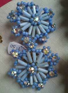
This pair form a star like shape, tapered of with points creating the octagon shape. The choice of blues is particularly interesting, one being pale and the other light - maybe they were meant to appear to be stars?
The brooch is particularly interesting with its glaze over the center that creates a boiled sweet like appearance and that beautiful border.

Below the slightly off white lines remind me of icing and the shapes themselves seem to imitate netting or lace of some kind. These would be my favourite simply with this reference to fabric.  


The abundance in usage of beads in the photos is pretty sweet, it has been rare for me to see such beautiful arrays of earrings with such a high standard of design and look using beads to construct and define.

Friday, 23 December 2011

Pretty Packaging: Herbal Essences

A free sample in Marie Clare, January issue - £2
Such pretty packaging I oculdn't 
resist scanning it into the computer.
This packaging has a great use of colour, 
such a tropical looking blue that has great impact, 
then on top the grunge like marks in silver and green. 
I just looked up what grunge actually means, 
one of its definitions is dirt and grime, 
the other being a type of rock music. 
But now I finally know.
The beautiful flowers adorning the packaging are orchids
and look at the detail of venation and marks on the petals. 
A short post this is, yes, but I'll be collecting some stuff 
to talk about in the next post. 
Oh and the shampoo and conditioner were amazing. 
Smelt lovely too.