The Old Reader is closing its doors, turning to become private and for people who are more likely to pay for it. I wouldn't mind at all except having already had to move from Google Reader to The Old Reader only a good few months ago and then getting used to (that didn't take long actually) the look, layout and workings of The Old Reader (I've grown to really like it).
At the moment I think I'll stay away from RSS feed applications and maybe experiment with other ones (both website built ins/extensions/stand-alone software) in the far future.
In the meanwhile some really interesting posts concerning patterns and surfaces found on the various blogs I have bookmarked:
Patternobserver.com
Michelle FifisStreet Patterns: Embroidery Details
This post is particularly interesting for me at the moment as I have been practising with hand stitched embroidery on various scraps of fabric, generally trying to work with different tensions to create textures as well as forming embroidered patterns or motifs.
Street Patterns Mexican Embroidery
Links in with the above post but whilst the above post was looking at contemporary or very geometric shapes, this one looks to the past, traditional floral motifs and vines and shapes used on ethnic embroidery of the past. I'm really liking the use of colour, very bold and striking, whilst the shapes themselves are large and blocky/like simple flower drawings.
iseepattern.com
Whitney Catarella
Buffalo Exchange Spring 203 Trends Part 1
The first image/print is beautiful! The tulips look magnificent against the dark star lit sky, and the lines on their petals look particularly fascinating (these lines originally come form a virus or some kind of bacteria/illness the plant has - at first bred because they looked distinguished and pretty - later found to be a weakness in the plant). The subsequent images are just as interesting, but the tulips really stand out for me.
beelah.com
Beelah'Crazy prints:) long modest pakistani dress'
This blogger/fashion blogger often highlights beautiful fabrics and textures, particularly modest dress which is an important thing within Islamic society and culture. Known for the spectacular colours, prints and embroidery, this blogger presents a brilliant collection of the fashion of Asia and the Middle East - well any where that modest beautiful fashion exists :D
Trend Tablet
Lidewig EdelkoortBloom
Press Ctrl F (use the text search bar) and then look up the following:
'Tools for peace'
The photos are beautiful and sweet, as is the idea of using flowers as tools to create emotional stability, peace and a kind of prosperity.
Also have a look down the page, lots of photographs - sharp and crisp with excellent visuals and colours.
Wednesday, 31 July 2013
Friday, 26 July 2013
Black, yellow and flowers
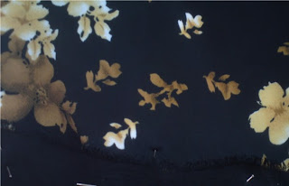
I've recently been going through my sack of textile remnants and pieces and have found that these pieces in particular seem quite odd. Normally I tend to stay clear of black or really dark colours, seeing them as tones or colours to be wary of - as if they are predators. But here I utilised them in a scheme to create interesting contrasts between dullish but bright yellows and creams and the dark blues and blacks of the fabric backgrounds - even taking pieces of suit trousers (worn out) to add to the long rectangular piece.

A fabric piece I have already blogged about here. It is one of my favourite pieces just because of the way the print is, colours used and the way it tiles in places - where the error of the overlap of the pattern/tile makes the piece all the more memorable.
Wednesday, 24 July 2013
Swirls, twists and silver
This is a small piece of a wallpaper sample I got from B&Q a while back, known as Laurence Llewelyn-Bowen Cote Couture Wallpaper.
I picked it solely because of its use of pattern, the damask type of patterns found on fabric where two types or thread are use to create a pattern within the very surface of the fabric.
The choice of tone and metallic colour is particularly interesting as it seems to refer to how in traditional damask fabrics, often one thread would be shiny whilst the other would be dull, presenting a pattern that would be shiny, standing out against the dull coloured surface. .
The damask is made up of floral shapes, petals, leaves - shapes often called paisley motifs as well as vines and other kinds of twists. The paisley itself has particular reference to the Greek motif of a tear drop
The wallpaper itself is not the best kind in terms of practicality, it rips and gets scuff marks quite easily; not the most hard wearing of wallpapers.
Friday, 19 July 2013
Peices of emulsion 'rock' forms
These kind of look tasty from a distance (if colourful things had food like taste to them),
but they don't smell of anything and feel very chalky - no surprise as I used matt emulsion
paints to make these by pouring emulsion mixed with a little glue onto plastic sheets,
from which the paint pieces then peeled from.
I define these more as paintings than anything else, their forms are sculptural but their brush like strokes and spills of colours portray the personality of a painting and are reminiscent of colour field painters - with their staining of canvas, where as I have poured colours from tins of emulsion.
I was hoping to include these in my degree show somehow, preferably making bigger pieces but because of their fragility I decided against it. They are brittle and crumble very easily, even after mixing three parts paint with one part PVA. Needs more experimentation.
Subscribe to:
Comments (Atom)


.JPG)
.JPG)
.JPG)


